Open topic with navigation
New Metadata Field/Edit Metadata Field
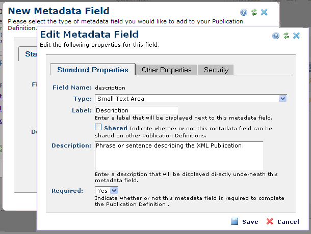
Use the Edit Metadata Field dialog to view or modify fields that request metadata for XML publications. Access this dialog by clicking the edit icon for an existing field or adding a new field to Publication Definition Metadata.

Standard Properties Tab
- Field Name - Displays the current field label.
- Type - Select a field type from the dropdown. CommonSpot supports over two dozen different field types out-of-the-box. You can also build your own custom field types. See Edit Form Field for details on field type options.
- Label - The label, not the field name, is presented to the user indicating the data required. It may be the same as the field name. Requires input for all types of form fields.
- Shared - Fields marked as shared, are shared across with other publication definitions. For example, if the field is a drop down list and you add new members, all occurrences of the field are updated to display new items.
- Description - The description for the field. It can be left blank if no description is needed. The description appears under each field to help users understand what type of data should be placed into the field.
- Required - Fields can be marked as required and/or shared. Fields marked as required are mandatory. If the field is not filled in, the user is presented with a warning message and cannot continue without providing a value.
Other Properties Tab
The field parameters that appear on this tab vary depending on the field type selected in the Standard Properties tab.

The following types may display on the Other Properties tab
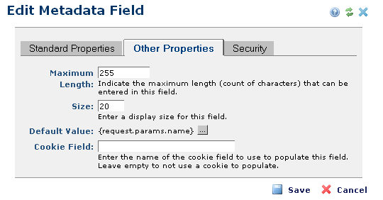
Maximum Length - Defines the number of characters allowed per field. Requires input for all types of Custom Element fields, except for the following types: Check Box, Image, Tree Control, Formatted Text Block, and Date.
Size - Defines field display size. Required input for the following types only: Text, Selection List, URL, and Email.
Default Value - Prepopulates the field with the value you enter.
Cookie Field - This option is available for Custom Element form fields, simple forms, and metadata forms. It enables pre-populating fields from cookie values. Use this feature to auto-complete forms containing fields completed in other forms. For example, once a user enters name, city, state, etc., in one form, fields requesting these values are prepopulated in the next form. You can use this feature for Text, Selection List, Multi-checkbox, Checkbox, and Radio Button fields.
Based on selections made for field type in the Standard Properties tab, the following options may also display:
- Checkbox List Source - Applies for Multiple Checkboxes. Values to display in the list can be: Value List, Custom Query, CommonSpot User Groups, a ColdFusion expression, or Custom Element/metadata or simple form data. If Value List is selected, you will need to type in the appropriate list of values in the "Option List" field.
- Option List Source - Applies for a Selection List. Values to display in the list can be: Value List, Custom Query, CommonSpot User Groups, a ColdFusion expression, or Custom Element/metadata or simple form data. If Value List is selected, you will need to type in the appropriate list of values in the "Option List" field.
- Radio Button List Source - Applies for a Radio Button. Values to display in the list can be: Value List, Custom Query, CommonSpot User Groups, a ColdFusion expression, or Custom Element/metadata or simple form data. If Value List is selected, you will need to type in the appropriate list of values in the "Option List" field.
- Option List - Enter a comma-delimited list of the options you want to include in the drop-down list. Require input for Multiple Checkboxes, Radio Button, and Selection List.
- Select Option - Place a "--Select--" option in the list and forces the field to be required. Cannot be used with a multiple selection drop-down list.
- Columns - Determines width of control box, what is displayed. Limited overall by Maximum Length parameter above. Requires input for Small Text Area and Large Text Area types only.
- Rows - Determines height of control box, what is displayed. Limited overall by Maximum Length parameter. Requires input for Small Text Area and Large Text Area types only.
- Value - The value to be entered into the database if box is checked.
Security Tab
The Security tab defines field-level permissions. Use this tab to assign users and groups specific rights to the field and its data.

Check Use Explicit Security to restrict editing access to this field. The Edit Security Settings button displays. Click this button to modify security settings through the Field Security dialog. Click the edit icon to selectively assign individual users or groups field-level permissions.
Related Links
You can download PDF versions of the Content Contributor's, Administrator's, and Elements Reference documents from the support section of paperthin.com (requires login).
- Developer's Guide
- Template Developer's Guide
- Shared Database Configuration Guide
- Replication vs Shared Database Guide
Sites upgrading from versions earlier than release 6.0 should review the following (from the support section of paperthin.com - requires login):
- What's New in CommonSpot 6.0
- CommonSpot 6.0.0 Menu Quick Reference
For technical support:
http://www.paperthin.com/support/
Open topic with navigation
